Friday, November 23, 2012
Thursday, November 15, 2012
Monday, November 12, 2012

Wednesday, October 31, 2012


Thursday, September 13, 2012

Thursday, September 6, 2012


Friday, August 31, 2012

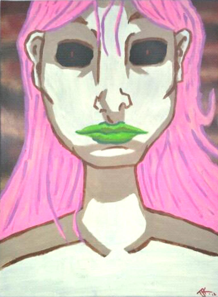
The Beast Inside Dark T-Shirt TJKernan Designs
The design looks sweet on a black t-shirt and hoodie too!
The Beast Inside Dark T-Shirt TJKernan Designs
The Beast Inside Dark T-Shirt TJKernan Designs

Thursday, August 23, 2012


Tuesday, August 7, 2012

Sunday, August 5, 2012
Friday, August 3, 2012
August Contest-Win Batman #1 And Other DC Comics
It is contest time!
I will spare you the long, boring details, because I am sure, much like myself, when you enter contests, you don't read them anyways ;)
This contest is about getting my name out there as an artist, and getting some much needed buzz for my new Indiegogo campaign to support my art.
THE PRIZE (One Winner will take home a DC Comics Prize pack containing all of the following:

Batman #1 (first printing) PLUS
*Justice League International #1 & 2
*Red Hood & The Outlaws #1
*Blue Beetle #1
*Blackhawks #1
These are all first printing from DC Comics new 52 Line. Each issue was purchased from the comic store by me, read once, then boarded and poly-bagged, so they are all in top-notch condition.
One winner will be selected within 24 hours of the contest winning. Please come back and check out the blog for the winning name. If you have any questions, please feel free to post a comment below and ask.
HOW DO I WIN?
a Rafflecopter giveaway
Working it good, looking for funding for the art...
So, if you looked over to the right of the page, you might see a little something new there.
I have started an Indiegogo campaign to help fund my art exploration.
Please, take a few minutes to go check it out. Then please spread the word around about.
I never forget the people who help me out! =)
TJKernan on Indiegogo
I have started an Indiegogo campaign to help fund my art exploration.
Please, take a few minutes to go check it out. Then please spread the word around about.
I never forget the people who help me out! =)
TJKernan on Indiegogo
Sunday, July 29, 2012

Wednesday, July 25, 2012


Tuesday, July 24, 2012

Thursday, July 19, 2012
New Art and Limited Edition Prints
Been working my ass off this week on new pieces.
First off, finished my three piece X-Men commission:
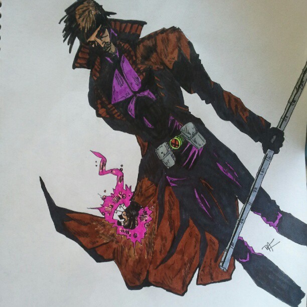
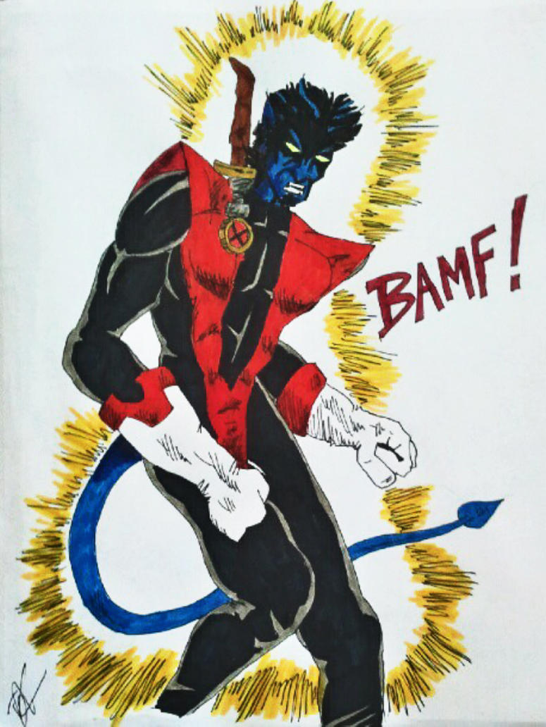

First off, finished my three piece X-Men commission:
Gambit
Nightcrawler
Storm
I also finished a new painting:
Dragline Hollow, 2012, acrylic on canvas, 18x24, for sale.
And just introduced, a new special print:
Dragline Hollow (Aquatic Azule Variant) Limited to only 20 giclee prints.
Monday, July 16, 2012
Saturday-Guitar Benefest II, featuring Pat Travers Band!
So, Saturday night was:
 And it was a great show!
Thanks to Wilson Productions (who put on the event) and the Hells Canyon Honeys (our local women's derby team) I was able not not only work the show, but also give away 24 tickets to lucky fans who got to come see the show for free!
Check out some pics from the show:

That is the man himself, Pat Travers, and I was standing up against the stage getting a pic as they were rocking out "Boom, Boom, Out Go The Lights".

Me, working the show, along with HCH girls Toasha Farrell and Elizabeth Taylor
 HCH girls Laura Badgley and Elizabeth Taylor mugging for the camera as band Blue Tattoo starts their set in the background.
Thanks to Wilson Productions (who put on the event) and the Hells Canyon Honeys (our local women's derby team) I was able not not only work the show, but also give away 24 tickets to lucky fans who got to come see the show for free!
Check out some pics from the show:
That is the man himself, Pat Travers, and I was standing up against the stage getting a pic as they were rocking out "Boom, Boom, Out Go The Lights".
Me, working the show, along with HCH girls Toasha Farrell and Elizabeth Taylor
Tuesday, July 3, 2012
Hi there.
Hello,
In case you haven't noticed the blog has been a little quiet. Traditionally, June is by far the craziest month of the year for me, and this one may have topped them all.
One month filled with three kids bdays, Father's Day, and this year we just moved into a new place.
Anyways, what does this mean? The blog will be back in full force this month. just got my internet back today at the new place, and I am waiting for a couple of cool packages for a couple of July Giveaways on the blog.
So, check back soon, promise to have new art and reviews and stuff up starting at the end of the week.
TJK
Monday, June 25, 2012
New Art, Rolling With The Changes...
First off, sorry about not posting much last week. it was a crazy one. Four family birthdays, three nights of Hells Canyon Honey activity, and an impending move coming next weekend.
Anyways, onto some new artwork.
First, is a little something I whipped up today...
 My experimenting with creating a comic. VERY experimental. It is just a start, something to play around with.
Anyways...
Original artwork aceo art cards designed by me. If you are interested in them, contact me for individual pricing on any of my trading card-sized art pieces...
Note: these pics were taken with my Instagram (and my first day of using it too) so the pics aren't perfect, but I have better pics of any and all individual cards if you are interested...


There are another dozen designs, I will post them sometime this week.
Alright, well, I am building the Hells Canyon Honeys official website, so i guess I had better get back to it! Have a wonderful day!!!
Anyways, onto some new artwork.
First, is a little something I whipped up today...

Anyways...
Original artwork aceo art cards designed by me. If you are interested in them, contact me for individual pricing on any of my trading card-sized art pieces...
Note: these pics were taken with my Instagram (and my first day of using it too) so the pics aren't perfect, but I have better pics of any and all individual cards if you are interested...
There are another dozen designs, I will post them sometime this week.
Alright, well, I am building the Hells Canyon Honeys official website, so i guess I had better get back to it! Have a wonderful day!!!
Wednesday, June 13, 2012
Three New Very Limited TJKernan Prints, New On Sale This Week!
Three new print available this week.
All are available in either a 20 x30 0r 30x20 premium giclée print on high-quality matte paper stock. Only 20 of each design will be produced TOTAL, making them a rare piece of art and a fine addition to anyone's art collection.
Each piece is $80.00 unframed (shipped rolled) or $170 framed.


Thanks for checking out my designs,
TJKernan
All are available in either a 20 x30 0r 30x20 premium giclée print on high-quality matte paper stock. Only 20 of each design will be produced TOTAL, making them a rare piece of art and a fine addition to anyone's art collection.
Each piece is $80.00 unframed (shipped rolled) or $170 framed.
TJKernan
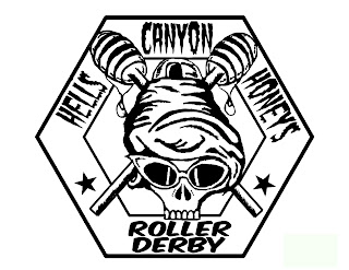
The Evolutions of Design: HCH Part 2 (The Logo)
So fledgling Roller Derby team Hells Canyon Honeys needed a logo. We had tossed around several ideas and some of the girls on the team had submitted several ideas for possible designs. There was a lot of division as to what they wanted to see-a skater girl, a queen bee, something with a honey jar, etc, etc...
Then team member kara Simpson brought for a design:

This design had potential, and my wife (and team creator) really liked it, but I knew it needed a number of modifications. The lettering was on of the biggest problems, splitting up the Hells Canyon Honeys, the breaking up of the "Hells" over the curve above looked jarring, and Roller Derby was larger and more prominent than the team's name. Also, I didn't like how the honey sticks came outside the lining six-sided shape but the bottom of the skull did not. Also, the star by itself below was distracting to me.
So I began to work on modifying the design...
 This was my first modified prototype. While I think it was an improvement, there were still things that bugged me, and my wife, about the design. The fonts for both the wording seemed wrong, especially the team name-it seemed just to cute. Also, the bottom of the piece seemed far too spacious, and while I liked the design of the face, it seemed too simplistic, it needed some more shading.
This is what i came up with...
I switched the logo font to something tougher, inspired by seventies punk. I switched out the Roller Derby to a stronger font. I extended the length of the honey sticks into the wording run, giving added depth, and assed a great deal of shading , hoping to give more depth to the design.
The girls liked it, and now we have this...

Yeah, that is me wearing my t-shirt from the hells Canyon Honeys first run of team shirts. Lovely pic, i know, what a photogenic guy I am. Hahaha.
And we have this...

That would be the first team tattoo with the logo on it. I have to say, it is very cool to have t-shirts with something you helped design on them, and even cooler to know people are permanently placing it onto their flesh.
You can find out more information about the LCV Hell's Canyon Honeys Women's Roller Derby Team at
www.facebook.com/HellsCanyonHoneys
And you can also buy team merchandise (many featuring my designs, I shameless plug) at
Hells Canyon Honeys & Roller Derby Merchandise
Please Note: 100% of all profits from the HCH Merchandise goes back into funding the team!
Then team member kara Simpson brought for a design:
This design had potential, and my wife (and team creator) really liked it, but I knew it needed a number of modifications. The lettering was on of the biggest problems, splitting up the Hells Canyon Honeys, the breaking up of the "Hells" over the curve above looked jarring, and Roller Derby was larger and more prominent than the team's name. Also, I didn't like how the honey sticks came outside the lining six-sided shape but the bottom of the skull did not. Also, the star by itself below was distracting to me.
So I began to work on modifying the design...

This is what i came up with...

I switched the logo font to something tougher, inspired by seventies punk. I switched out the Roller Derby to a stronger font. I extended the length of the honey sticks into the wording run, giving added depth, and assed a great deal of shading , hoping to give more depth to the design.
The girls liked it, and now we have this...
Yeah, that is me wearing my t-shirt from the hells Canyon Honeys first run of team shirts. Lovely pic, i know, what a photogenic guy I am. Hahaha.
And we have this...
That would be the first team tattoo with the logo on it. I have to say, it is very cool to have t-shirts with something you helped design on them, and even cooler to know people are permanently placing it onto their flesh.
You can find out more information about the LCV Hell's Canyon Honeys Women's Roller Derby Team at
www.facebook.com/HellsCanyonHoneys
And you can also buy team merchandise (many featuring my designs, I shameless plug) at
Hells Canyon Honeys & Roller Derby Merchandise
Please Note: 100% of all profits from the HCH Merchandise goes back into funding the team!
Monday, June 11, 2012
The Evolution of Designs: HCH Part 1
So, as my new rebirth as an artist begins, my wife has begun a change as well. She started a local woman's roller derby team. A new team means designs have to be created-flyers, logos, and other artistic endeavors. This is where I come in...
Early designs:
 This was the first design for a flyer after the wife started tossing the idea around, not long after she, and a couple of the girls, decided they wanted to be the hells Canyon Honeys. However, there were things she didn't like on this first design. One of the biggest was the 'derby dames' above the initial logo name design. It looked too much like a design of another nearby derby team, so it was scrapped for a second version...
 This revamp of the last design was better, scraping the 'derby dames' in favor of an explanation on top of the logo, as well as enlarging the logo name and coloring it better, as well as adding better color to offset the background. However, this wouldn't last long-This flyer does not provide enough information and the "bee girl" wasn't what Myn was looking for to exemplify the team.

With the "bee girl" above not liked, I sketched up another bee girl, and stuck her on a black and white flyer which eventually became the first flyer the team produced and actually used...
 This one was filled with all the information you could stuff on a page.
Meanwhile, I started designing some merchandise for the HCH, because they need sources of income in order to fund the team's needs:
 Like this bumper sticker you can get HERE.
But, the girls still needed a full picture emblem with logo, something to stick on t-shirts and advertise with.
(and I will continue that later, in part two... ;p)
Early designs:


With the "bee girl" above not liked, I sketched up another bee girl, and stuck her on a black and white flyer which eventually became the first flyer the team produced and actually used...

Meanwhile, I started designing some merchandise for the HCH, because they need sources of income in order to fund the team's needs:
But, the girls still needed a full picture emblem with logo, something to stick on t-shirts and advertise with.
(and I will continue that later, in part two... ;p)
Wednesday, June 6, 2012
Limited Edition TJKernan Prints For Sale.
New this week, limited edition prints available through my deviantArt page, TJKernan
All of these prints have very limited runs. Basically, after 20 *total* prints are sold, regardless of style or size, the print is retired for a minimum of one year, if it comes back at all (and knowing me, if it does return, it will be in a different color and/or have design changes, because I never like to do the same thing twice...)
New Print Available:
 | ||
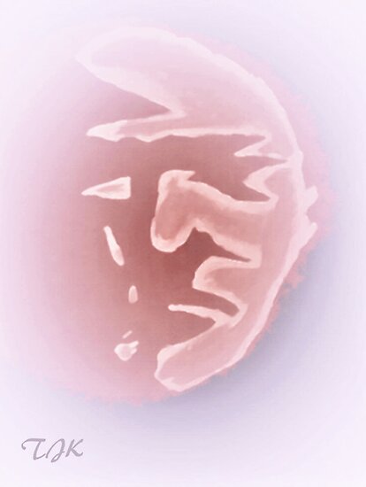
| Fury of the Phoenix |
These print is available in Premium giclée prints on high-quality matte paper stock and on canvas.
 | |||||||||||||||||||||||||||||||||||||||||||||||||||||||||||||||||||||||||||||||||||||||||||||||||||||||||||||||||||||||||||||||||||||||||||||||||||||||||||||||||||||||||||||||||||||||||||||||||||||||||||||||||||||||||||||||||||||||||||||||||||||||||||||||||||||||||||||||||||||||||||||||||||||||||||||||||||||||||||||||||||||||||||||||||||||||||||||||||||||||||||||||||||||||||||||||||||||||
| The Occurrence of Wonder V2.0 |
Subscribe to:
Posts (Atom)